Sunday, 5 May 2013

How effective is the combination of your main product and ancillary texts?

I am aware that I said I was only taking a short break but I've been stumped on this question for a while. Plus Dirty Dancing came on.


How does the poster sell the album?

The links between the poster and the album is an obvious way of the poster selling the album, as the links make sure the target audience are reminded of the digipak when they see the poster. The inclusion of the sell-date helps to sell the digipak, because the target audience will know when they can purchase the album and can build anticipation for it.

How does the music video sell the album?

The music video sells the digipak for a variety of reasons. As discussed in my 'conventions of a rock video' post, having shots of the band out of narrative, performance and conceptual (eg. our shots in the field) elements makes the band seem like real people, and this encourages listeners because (as I said in that post) nobody wants to buy music from an emotionless robot. It also appeals to our younger target audience, because they often like to imagine they can meet and relate to their favourite bands, so making the band seem more human encourages this.

Having the band in the video also helps to sell the music video because it links them to the music and the album, as their faces would be recognisable on the digipak from the music video.

How does the digipak design sell the album?

The digipak design would sell the album because it is designed to hit a specific target audience. The bright colours, bold font and scribbled drawings would all make it stand out in a shop (and most importantly as a thumbnail on iTunes, as digital sales are vital these days), so when our young target audiences are browsing, this will grab their attention. The brightness and drawings also attract the target audience because young people generally like colourful, quirky things.

The inclusion of the male actors on my digipak will also appeal to the younger females in my target audience, because they tend to gravitate towards any male that's vaguely famous; having them on our digipak makes them seem famous and so the young audience will like it and hopefully buy it.

I think the combination of my three products is effective because there are enough links to keep the album memorable in the heads of my target audience. There are more links beween the poster and the album than either of them and the music video; however, the poster is there specifically to sell the album whilst the video is there to sell the album, but it is also there to entertain. Therefore, I feel the combination is successful because it is not too in your face but does help to sell the album.

What have you learned from your audience feedback? (part 2)

For my digipak and advertising poster, my basic idea spawned from the lyrics within the song, which (if I was selling the album for real) would be the lead single. The main theme of the song is falling in love with an awful guy, or a "monster", and so I went along that vein for my digipak. In the process of making the first draft, I received feedback from my media class on how to improve, and after I finished my first draft I received feedback (once again) from people on surveymonkey.com.


The feedback from the first draft was that: 
  • They liked the theme of the monsters and the idea of normal guys as the monsters.
  • They liked the colour scheme.
  • They thought the doodles were quirky and looked good; it was quoted as being the majority's favourite part of the digipak.
  • They thought it was eye-catching.
However,
  • Someone thought the image of the Frankenstein's Monster looked a bit badly edited.
  • Someone didn't like the solid green background.
  • A couple of people weren't sure on the institution information included.
  • They wanted a picture of the band on the front (I hadn't taken the picture at that point, but it was added on after).
This information was really useful to me, because it showed me where to improve. To better please the target audience, I changed the background of the inside slides so they weren't solid green; blurred the edges of Ben as Frankenstein Monster so that it blended better with the background and looked less harsh; added a violet filter to soften the tone of it a bit.

I then presented my final draft to my friends and family, with the first draft also shown so they could compare. They liked that I'd included a band picture, softened the tone and changed the backgrounds. Their only real problem was with the institution information still, but I felt that I had edited them to the best of my ability.

Thursday, 2 May 2013

What have you learned from your audience feedback? (Part 1)


I'm also going to direct you to this post: http://wittymediarelatedurl.blogspot.co.uk/2013/05/how-our-music-video-drafts-progressed.html because it outlines exactly what the audience feedback said. I just thought it might relevant so if you want to look at that too then that would be fabulous.

We also carried out research at the very beginning of the year to confirm which band name we were going to choose. We came up with a list, narrowed it down to about 5 and sent out a survey on surveymonkey.com to my Facebook, Twitter and Tumblr friends.


These surveys were important to us in creating our brand image, because it meant that we could name ourselves something our target audience would like. I can't stress the importance of social media in our research; our target audience are young people and almost every young person has an online persona on at least one website. Therefore, social media was crucial to our research because it meant we were hitting our key target audience (15-25). Not literally hitting but you understand what I mean.

After we had created our band name and image, we gave a presentation to a focus group comprised of members of our target audience:


This was also invaluable to us, because it highlighted where our audience liked what we were doing and where to change; however, they mostly liked our ideas so we went ahead with them.

In what ways does your media product use, develop or challenge forms and conventions of real media products?

This is an evaluation question, but you knew that. In what ways does your media product use, develop or challenge forms and conventions of real media products? In this post, I'm most likely going to reference my conventions of a pop video post, because that seems relevant, as the question is about the conventions of real media products. I'll post that Powerpoint here for easier reference:


 I thought I would venture into the scary world of Prezi for this part of the question; please don't eat me if it's terrible. Me and Prezi aren't really friends.


This is the same question, but focused on my digipak and poster.


Advertising Campaign Poster


Here is my final draft for my advertising poster. I used the same basic design as I used for the digipak, to link to two and thus enhance sales (if I was to sell the product). I did make some changes to the design, however, as I felt the busy design of the digipak would not be as effective on the poster, as it may seem too cluttered with the extra text. I used the same fonts as I did in the digipak, as it links the two products, and I used the same picture I used on one of the slides for my digipak for this reason also.

Digipak Final Draft

Front cover:


Back Cover:


Slide 1:

Slide 2 (inside):


Slide 3 (inside):

Slide 4 (inside):


Wednesday, 1 May 2013

How did you use new media technologies in the construction and research, planning and evaluation stages?


This is evaluation question 4. But you can read so you knew that already. Enjoy.

How Our Music Video Drafts Progressed.

Here is the thrilling tale of our drafts, how they were received, and how we changed them because of that feedback. I was waiting for all the drafts to be finished before I made one big master post of the video drafts, and now we're finished, here it is.


This was the very first draft we ever did. As you can see, the shots were shaky and there are massive black spaces, but there's a post dedicated to that earlier on the blog. I showed this to my friends and family, and they told us that:

  • The camerawork didn't do it for them.
  • They liked the concept of the narrative.
  • They especially liked the photobooth shots because it went with the music.
  • Some of the acting in it looked incredibly bad.
In response to these comments, we produced this:


Here, we re-filmed the narrative shots, but kept the photobooth shots, in accordance to the feedback we had received.

We then showed this to people are their comments were that:

  • They still liked the photobooth scene.
  • They thought the camerawork had improved.
  • They liked the idea of the narrative still.
  • They thought the phone section could have looked a bit better.
  • The last narrative scene seemed a bit rushed.
  • The last shot didn't seem to flow.
  • There was a continuity error in the last narrative scene, with people magically moving places.
In response to these comments, we produced this, our final draft:


The feedback we got from this one was:

  • They liked the performance bits, as they thought it showed us well as a band.
  • They liked the house bits, but they didn't get why we were all different colours.
  • They liked the bit with Ben looking at the notes and especially the clip of the arrows along the wall leading to 'come in...'. I like that bit, too. I didn't at first but it's grown on me.
  • They liked that we fixed the continuity error.
And that is the magical story of our music video. 


Thursday, 4 April 2013

Read at once if convenient. If inconvenient, read all the same.

Hello, my lovelies, I need to ask a favour. If you could please look at the front and back cover first drafts below, and then fill out this survey for me?

http://www.surveymonkey.com/s/SCJN7V3

(The draft of the front cover isn't completely finished, it needs a couple more doodles and an image of the band).

Thank you!

Wednesday, 3 April 2013

Opinion Poll Time.


For the inside three slides on my digipak, I was thinking that I could put the lyrics in a doodly font and put them there, to keep in with the doodly theme and make it seem more personal.
Now, here is where I need help. I am uncertain as to whether to do the font in black or pink? The rest of the font in the album is pink, but that might be an eyesore. Also, I'm unsure whether or not to do all the lyrics and cover the page or just to put sections of lyrics on random places on the page?


I think I'm leaning more towards lyrics scattered, because a) I have to type out every single lyric to the song and then come up with lyrics to the songs I made up. I'd do that, in fact, I came up with some lyrics earlier for 'Dear Jimmy' in case I decided to do the whole lyrics thing (we also made up lyrics to Daisy but I think they're slightly inappropriate) and because b) it might be an eyesore having all the lyrics on it.

However, I will leave it to the voting public. For option a, call 0845 674 892 and for option b, call 0845 674 893. Calls are charged at standard network rate and calls from mobiles will cost considerably more. Lines close on 23rd May 2013, votes cast after this time will not be counted but may still be charged.

Edit: I asked Jess and she said she liked black font with the text everywhere and not just scattered. Thrilling stuff.

Fonts and Colours.

This post is more for me than anything, but here are the fonts I've been using and the colours that I've been using. This way, I can just come here for reference and won't have to guess.

The Machine Ate Florence: Suckerpunch (fontmeme.com)
Monsters/track listing: Frankenweenie (fontmeme.com)
Lyrics: Fmiring-Campotype-One (fontmeme.com - grafitti section)

Background colour: #91f683 (pale green)
Pink: #e856e8

Digipak Front & Back Cover Initial Drafts


Hello. Here are the initial drafts (minus the photography on the front cover of the 'band') of my front and back cover for my digipak. I decided to have the doodles on the front cover because, as I have discovered through analysis of music videos and digipaks, bands like to include something that makes it seem personal (eg. a 'backstage tour' music video) and I thought the doodles would establish this. Plus I like to doodle. I think I need to add more doodles, such as fire on the buildings, to suit the title of the album. Many thanks to fontmeme.com for providing me with fonts.
 
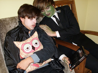
The kind soul on the back cover is our friend, Ben. He agreed to dress up as Frankenstein's Monster for me. This wasn't meant to be an actual shot, but I found it so hilarious I took a picture of it and then it actually ended up on the digipak. The picture suits the overall theme of monsters in normality, as it features Ben in an everyday situation whilst dressed as Frankenstein's Monster. I included a barcode and institution information to make it look official, and made up logos for the companies for this reason as well.
 
Can you guess where I got the titles for the songs from? English Lit 4 lyf.


Thursday, 21 March 2013

Advertising Campaign Analysis.

Advertising Campaigns Analysis. from Sarah Byard

I know what you're thinking: that's great, Sarah, but why is this relevant? I'll tell you for why. This has helped me to understand how different bands at different stages of their careers advertised themselves: Fall Out Boy (relatively new at the time), Muse (established) and REM (super established). As our "band" is "new", we'll be taking the advice of the wise and wonderful Fall Out Boy:

  • We will need to feature an image of our band, or else nobody will know who we are.
  • We will need to feature our name prominently.
  • Institution information and a release date will be useful to attract target audience.
  • We could include a conceptual picture; however, it would not be prominent as we are not established enough to get away with a single image yet.
  • Linking the poster to our digipak is extremely important; we could link it to the music video, but the digipak is more important because that's what people would be buying.
  • Big, bold fonts will get us noticed more.
Cheerio, toodle-pip.

Wednesday, 27 February 2013

My blogger recently got hacked. I apologise for anything posted in the last week...

I say hacked, I mean I probably left it logged on the Macs.

Friday, 15 February 2013

Intertextuality.

Hello. Lately, me and Hannah have been considering intertextuality in our digipaks and music video. 


Music Video:

For our in our final narrative scene involving a confrontation with Ben, we thought it would be pretty good to include an intertextual reference to The Craft. In The Craft, there's four teenage girls who learn how to cast magical spells and become witches. We don't have witches in our music video, although that would be cool, but there are similar themes across the two. There are themes are girl power, deceit and friendship in The Craft, which can also be found in our piece. 

The scene we are going to tip our hats to really captures the girl power theme, as it's a scene where the girls are performing a ritual to a god. Obviously, we're not going to do a ritual or sacrifice Ben to the gods. However, I quite enjoy their formation in it. I'll show you a picture.


This isn't the best picture but it's the only one I can find of this scene. Just go and watch The Craft, it's a fabulous film. I thought the scene I'm thinking of was set during the day but I'm obviously wrong.  Anyway, I thought we could get rid of the candles and the chanting and just steal their basic formation and the idea of being powerful, because a) I love The Craft and b) it suits our themes.

The second intertextual reference is from The Scarlet Letter. In this, the woman has a scarlet 'A' stitched onto her clothing to declare that she has committed adultery. Whilst we may not stick an 'A' onto Ben (it may be a black heart to suit the song lyrics), something will be stuck to him to show he has been around. This paragraph wasn't as long because it's not as interesting but hey ho.


Digipak:

My digipak may as well be one big intertextual reference. Because the album is called Monsters, I've decided to have Hammer Horror monsters on my digipak. I've got Ben as Frankenstein's Monster and another Ben as Dracula and Jade as a mummy. I picked these because they are instantly recognisable to the target audience (I've explained this is more detail in another post).


Digipak Photography.

Today, the original photography process began. In my photographs (as explained in a previous post), I'm having three people dressed up as monsters with the 'band' in normal clothing. Only two of my three monsters were available today, so I photographed the first two pictures and also got an idea for some other things I could include (once again, thanks to the advice of Hannah). The other things I can include are going to be the 'monsters' doing every day things, like reading books etc. 

I don't want to give anything away (I say that as if it's a much anticipated event when it reality it's just my digipak and nobody will really care if I post the entire session right now), but here are some of the pictures taken today...


(It looks like I gave Jess no help with the face paint but I did, I just had to take a picture whilst she was doing it so I could post them on here!)

Tuesday, 12 February 2013

Filming Updates.

Right, so our latest draft is coming along nicely. We have nearly the whole narrative finished. Today we filmed Livvy's phone bit, which completes that section. Now we just need to film the final scene of narrative (which won't take long), the performance shots and we need to snap the shots of the House Of Booty. Then we will be done.

I'll post some raw footage once I've converted it!

Tuesday, 5 February 2013

Digipak Sketches.


This is the sketch design for my digipak. As you can see, I cannot draw, but I thought I would try regardless. Our album is called 'Monsters', so I thought I'd go along with that theme and have monsters everywhere on the digipak. I'm going to feature photography of monsters and the band, as well as cartoon drawings of monsters that I'm hopefully going to make on Photoshop (because I clearly won't be able to hand draw them).

The inside panels will feature a girl and a monster on each, doing normal, couple-y, romantic things. The pictures actually depict them swooning and screaming and stuff, but I changed my mind, on the helpful advice of Hannah. I'm going to have three different guys playing the monsters, and there'll be a mummy, Dracula and Frankenstein's Monster. I've gone with a Hammer Horror theme because they're so easily recognisable that the target audience will get it. 


INSIDE.


This is a girl with a mummy. I'm going to cover one of my friends (probably Jade, she's volunteered. Probably as a joke but I don't care, you don't joke around me about mummies. And she's Egyptian, it's perfect) in tissue paper to get the mummy look. It's going to be fabulous. In this one, they will be sitting on a sofa, hugging or something.


This is a girl with Frankenstein's Monster. I'm going to use the Boris Karloff version of the Monster, even though it kills me not to use the actual book one, because it is instantly recognisable as the Monster. If I used the actual book Monster, the target audience wouldn't recognise it. Our target audience is younger people, who probably won't have read the book. These two will be walking along hand in hand. For this Monster, I'm going to need green face paint and bolts. I'm going to have Frankenstein's Monster wearing a suit because I like suits.


This is a girl with Dracula. For this one, I need to get a cape and some fangs, and possibly some fake blood from Poundland. I'm going to need someone to wear a fancy three-piece suit for this one and then I'll whack the cape on. I might need some white face paint to pale the person up as well. In this one, they're going to be at the breakfast table.

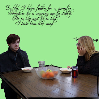
I've chosen to have the girls with monsters due to the title of the album. They're doing couple-y things to suit the theme of the lead single: Dirty Heart. In this, the girls are in love with a guy even though he's a "monster", so I thought these pictures would fit that theme. Also, Hannah helped me come up with that because she's fabulous-o.

OUTSIDE.


(the bell has just rung so I will complete this when I get home)


Sunday, 3 February 2013

Maroon 5 Marketing For 'Overexposed'.

Overexposed is Maroon 5's fourth studio album, which was released in June, 2012. Here is how they've marketed it and its singles:


This is what you see when you first go onto Maroon 5's website; it's there before you even enter the actual site. This draws attention to the fact that they have a new single out, and also encourages the user to buy it. This would be extremely useful for Maroon 5 fans who want to buy the album/song, because they wouldn't have to hunt them down. Because of the link to buy the song/album, it discourages illegal downloading, most of which occurs because it's effort to find the track.


The Twitter page for Maroon 5 features the same image as the home page, creating consistency across the marketing campaign. This consistency makes the campaign recognisable, as it is more likely that the audience will remember it if they have seen it many times in different places.

 The actual tweets also promote not only the album and the song, but other promotional events that are occurring, such as Adam Levine's appearance on Saturday Night Live. This encourages the audience to watch even more promotion for the album and song, and therefore making it more likely that they will make a purchase.


This is on the homepage of Maroon5.com. As you can see, it is consistent with the other two campaigns. Maroon 5 fans will be likely to check their Twitter and their homepage, so this bombardment of advertisement encourages sales from the target audience. 

The text used in the marketing campaign is bright and doodle-y. This matches the album cover.


The album cover is bright, it's doodle-y and it stands out. It's very different from Maroon 5's past two albums:


However, the style of artwork is somewhat similar to the band's first album, Songs About Jane:


It Won't Be Soon Before Long and Hands All Over did not receive great commercial success; however, Songs About Jane did. A return to similar artwork could suggest to fans that the band is returning to the Songs About Jane era in style (which they're not, but they might want to give that impression). It also links, for people aren't fans, this album to the first album. People who aren't die hard fans probably would have missed the 2nd and 3rd album, but they probably have heard at least one Songs About Jane single, so linking the new album to the first allows for new listeners.

The bright colours also signify a change from quite downbeat songs to upbeat, more pop-style songs. It also makes the album stand out on a shelf, so it is more likely that a person would see it and want to buy it. More importantly, this image would stand out as a thumbnail on iTunes, making the potential listener think about clicking on that one instead of another, because it's bolder and more noticeable. The brightness also appeals to the target audience, who are generally young people, and young people enjoy quirky things.

Other promotional activities included:
  •  an interview with The Sun: http://www.thesun.co.uk/sol/homepage/showbiz/sftw/4401007/Maroon-5-frontman-Adam-Levine-It-used-to-be-uncool-to-like-us-but-now-its-OK.html
  • Adam Levine hosting SNL.
  • Adam Levine being in American Horror Story (not a direct promotion, but it still works. People who watch AHS generally are the same target audience for Maroon 5 albums).
Most marketing outside the Twitter and homepage revolve around Adam Levine, not the rest of the band. Normally, I'd think that's a pretty low thing to do to the rest of the band, but look:

He clearly deserves lots of attention.


A CD Carol.

Ghost of Sales Past.

Let me take you on a journey to the 1990s. This was a time of high frivolity and high music sales. In the 1990s, there were record sales as high as 208.388 million units (1996), with 76.65% of that coming from CD sales, so the music industry was booming. The introduction of the CD greatly increased record sales, as they were easier to transport (making them easier for buying), smaller, more compact and could hold more song, making them more desirable to the music buyer.

All in all, the music world was wonderful in the past. People bought physical copies of albums, bands made more albums and ALL WAS GOOD.


Ghosts of Sales Present.

Let us now travel to present day, the last five years to be precise. This is not a time of high frivolity and high music sales. In 2009, 128.946 million units were sold, a slump of around 80 million units from 1996. 2010 and 2011 show similar stories, with sales of 119.07 million units and 113.186 million units respectively. In 2012, 100.5 million units were sold. 2013 has only just begun, but sales in January were up 11.6%

The slump in album sales has come from digital sales and, more importantly, illegal downloading. In 2010, the CD market fell to 98.5 million units; digital sales went up to 21 million units. Whilst CD sales are still important, digital sales are slowly creeping up. However, they are not creeping up enough to make up the statistics, and other types of music sale (eg. LPs etc.) aren't making it up either. It's estimated that 1.2 billion tracks were downloaded illegally in 2010, and in the first half of 2012 alone, over 40 millions tracks were downloaded illegally. From these statistics, it's clear to see that the music industry has a real problem with illegal downloads.

Ghost of Sales Future

The year is 3000. Not much has changed, but we live underwater. CDs have become obsolete. Simon Cowell has incorporated all record labels into one, and only recruits one person a year, the winner of X Factor, which is now on its 8947657863th season. The only challenger to Cowell is Globalsoft, but they only wanted digitalised, computer generated music; neither option is preferable. Worst of all, Busted never got to realise their dream of a multi-platinum 7th album.

All the statistics from the ghost of sales present point to a decline in the music industry's sales of the physical CD. Soon, not many people will  buy CDs, instead choosing to buy the tracks from iTunes or downloading them illegally. With so many ways to pirate, such as filesharing, YouTube conversion or simply getting your friend to send you songs, it's going to be much harder to tackle piracy than the music industry is prepared for.

Sources for statistics:

http://www.zobbel.de/stat/uksales_a.htm
http://www.digitalspy.co.uk/music/news/a454951/single-and-album-sales-off-to-strong-start-in-2013.html
http://www.guardian.co.uk/business/2011/jan/05/album-sales-plummet-sixth-year-running
http://www.bbc.co.uk/news/technology-19599526

Friday, 1 February 2013

Star Image.

Digipak Vs. Jewel Cases.

Digipak:

 A digipak generally consists of 4 or 6 panels (+ spines). They contain either one of two CDs, or a mixture of CD and DVD (this is mostly for live CDs, such as The Black Parade Is Dead! - My Chemical Romance). They include all institution and band information, and most include a lyric booklet in a sleeve.

Digipaks are usually made of card and plastic, and usually have a promotional sticker on the front cover to aid sales.

Jewel Cases.
Jewel cases contain only four panels. They
generally contain one CD (with exceptions such as double albums (eg. Opposites by Biffy Clyro) or CD/DVD combinations, usually live albums. They are very basic, including only the CDs and very rarely lyric booklets. There is less space on a jewel case than a digipak, and so less design space. Jewel cases include all relevant institution information.

Jewel cases are usually made from clear, rigid plastics.

The main differences between the two are number of panels and production material. Because there are more panels and generally more extra material in a digipak, these are more expensive to make than a jewel case. Most music fans have also come to prefer the digipak, with complaints on the jewel case such as them cracking too easily or allowing the CD to fall out.
                                           
 Whilst digipaks are preferable to many music fans, they're actually more expensive to make. On oasiscd.com, a set of 300 digipaks would cost $890, which is around £565 in actual money. However, the same amount of jewel cases would cost $789, which is around £501. For this reason, digipaks are currently a bit more expensive to buy, but there is usually only a couple of pounds in it.